October 9 is Hangul Day (한글날 Han'gŭllal), an annual commemoration of the 1446 proclamation of the invention of the Korean alphabet by King Sejong (세종) and / or his scholars. Hangul is the most sophisticated writing system actually in use for a real language. Geoffrey Sampson, in his Writing Systems : A Linguistic Introduction, at the end of a chapter on Hangul (p. 144), writes, “Whether or not it is ultimately the best of all conceivable scripts for Korean, Han'gul must unquestionably rank as one of the great intellectual achievements of humankind.”
This year, we decided to go to the Korean market near MIT (after dinner at the Bengali restaurant, where the eggplant and potato dishes are made with generous amounts of mustard oil, a topic for another day), not just for the groceries, but also their typography.
Wikipedia's article on Hangul is pretty thorough, but it is worth summarizing a few points.
- The letters of the Hangul script mostly represent the phonemes of Korean.
- Vowel length is not represented, though it is distinguished: for example, 말 mal 'horse' vs. māl 'language'. But the functional load of vowel length is not very great, like in Latin, and unlike in Finnish. Also, this distinction is disappearing from the modern language.
- The basic letter forms combine into clusters (single, double and triple) called chamo 자모, which are the building blocks of the script.
- Hangul can defensibly be called a featural script, in that like aspects of each phoneme are presented by like graphics in the chamo. This is the position taken by Sampson and in The World's Writing Systems. However, Young-Key Kim-Renaud in a paper in the collection The Korean Alphabet, which she also edited, does not accept this classification and considers that it actually diminishes the achievement.
- The proclamation was titled 訓民正音 Hunmin Chŏng'ŭm 'The Correct Sounds for the Instruction of the People'. This was also the official name of the script. It was written in Classical Chinese, the language of scholars; it was also published in a form where each Chinese character had a smaller Hangul phonetic beside it. The Chinese text is in Wikisource. A scan of the annotated version is online on the Hangul Foundation site. It is also available as a Unicode text file, with the syllables that cannot be represented (since Unicode encodes Modern Korean) in a Private Use Area for which there is a New Batang font (Google for nbatang.ttf).
- In 1940, a second expository document from the time of King Sejong was discovered, titled 訓民正音解例 Hunmin Chŏng-ŭm Haerye '… Explanations and Examples'. It is written in Classical Chinese, with Hangul only used when it is explained. It is on the same Wikisource page and here (with a Japanese translation). A scan is here (with a partial German translation).
- The Haerye proves that the shapes of the consonants were chosen to represent the physical points of articulation and not as abstract designs. For instance,
牙音ㄱ,象舌根閉喉之形。
舌音ㄴ,象舌附上腭之形。 (p. 9)The tooth sound k has the shape of the back of the tongue closing the throat.
The tongue sound n has the shape of the tongue attached to the roof of the mouth. - Although it is generally assumed that the design was a group effort, there is no reason to doubt that King Sejong participated and it is even possible, as proposed in a paper by Ki-Moon Lee in The Korean Alphabet, that he was primarily or solely responsible. Lee provides quotes claiming responsibility fairly directly and addressing the obvious questions, such as how he could have time in addition to affairs of state.
- It is also not known to what extent the design of Hangul was directly influenced by other scripts. Possible antecedents, and in particular 'Phags-pa, are discussed by Gari Ledyard in his thesis and a paper in The Korean Alphabet.
- The literati naturally objected to the new script as a threat to their prestige. This lent support to alternative names for the script such as 언문 ŏnmun 'vernacular script'.
- Only a few decades after Sejong the Great, the script also lost royal support: it was banned by Yŏnsan'gun (연산군) the not-so-Great, supposedly because it provided more people with the means to post criticism of his rule.
- Through the end of the 19th century, therefore, Hangul was primarily used for novels and light poetry.
- The name Han'gŭl 'great script' (or 'Korean script') was only coined at the beginning of the 20th century by Chu Sigyŏng. I have not seen a specific citation of earliest occurrence. The Wikipedia says 1912 on the Hangul page and between 1910 and 1913 on his page. Martin just says 1910. This footnote points to Ross King's article on language issues in Korea Briefing : Toward Reunification, which gives the same 1910-1913 range, with a footnote pointing to this book (Problems of Korean Language and Writing the Unification Age) by Ko Yŏng-Gŭn (고영근), with no particular page reference, but perhaps intending 한글의 유래 ‘Hangul’-ŭi yurae 'The Origin of the word “Han'gŭl”', as also referenced here, and reprinted in several other places. Citing Ko, this page says it was first used in publication on 23 Mar. 1913 and then in a footnote that it was apparently already in common use on 3 Sept. 1911.
- Korean has a rich set of regular phonetic assimilation rules. For most of its history, Hangul was used to write Korean as pronounced. It was only with 20th century spelling reforms that it became morphophonemic, so that the same stem is spelled the same regardless of (that is, “before applying”) these rules. Already, the Haerye had said:
That is, ㅈ c and ㅊ ch are to be spelled ㅅ s when final (not preceding a suffix's vowel), as they were pronounced. However, in King Sejong's own works, such as 月印千江之曲 월인천강지곡 Wŏrin ch'ŏn'gang chi kok 'Songs of the Moon Shining on a Thousand Rivers', the several different terminal consonants are used, suggesting that he himself favored the approach now used.如ᄇᆡᆺ곶爲梨花, 여ᇫ의갗爲狐皮, 而ㅅ字可以通用, 故只用ㅅ字. (p. 42)
[For terminals] like those in pʌys koc 'pear blossoms' and yaz˙ɨy kach 'fox's skin', s may be applied throughout. Therefore only the letter s is needed. (tr. Ki-Moon Lee p. 20)
- In short, highly successful Hangul is a product of the post-War Korea of industrialists and Kpop idols, where there is as much competition from English as Chinese. JSTOR provides a contemporary summary of the language reforms from a paper published in 1948. There are some differences in orthography between the South and the North, described in an article by Ho-Min Sohn in The Korean Alphabet. The broader picture of language policies in the two countries is discussed in the Reunification article.
- Hangul is normally written in syllable blocks, consisting of an initial consonant (초성 ch'osŏng), a medial vowel (중성 chungsŏng), and a consonant coda (종성 chongsŏng, always drawn at the bottom and so known as 받침 patch'im 'platform'), taking the same square form as Chinese characters, with the size of the components being adjusted depending on the density, again as in Chinese. One of the proposals made by Chu Sigyŏng that did not take hold was writing the components uniformly in a line, a style known as 가로쓰기 karo-ssŭgi 'horizontal writing'. An article by Ross King in The Korean Alphabet describes experiments with this kind of writing (also known as 횡서 hoengsŏ 'on-line') in Russia and the USSR.
- Early Hangul was drawn with symmetrical right angles and circles. Then, as it came to be written with a brush in Chinese style, it was drawn following those conventions. As a result, in brush style, ㅅ is not symmetrical, ㅁ is clearly composed of three strokes, and ㅗ and ㅜ are not mirror images because 點 dian3 can be used above a line, but 豎 shu4 is needed below.
- The most common Korean keyboard layout, Dubeolsik (두벌식 tubŏlsik) is also rational and efficient, with consonants on the left and vowels on the right, arranged in a featural grid.
In addition to the sources linked to by the Wikipedia, there is an online Hangul Museum. The English part of the site has roughly the same organization of, but not the depth of, the Korean version. The Korean version has a quirky navigation system, but contains lots of interesting pages like this one with a chart showing how the letter shapes relate to the organs of speech, and another with a chart showing how changes in the means of articulation at the same point are reflected in the letters. Plus, scans of early books, like this one that contains part of Wŏrin ch'ŏn'gang chi kok showing the earlier forms of Hangul.
Hangul Day was a legal holiday from the founding of South Korean until 1991 when it was removed due to too many days off in October. There is a petition to reinstate it; see here on the "InterNet HanMal and HanGeul Society" site.
The postscript to the Haerye has some amusing and extravagant claims.
莫不該括以二十八字而轉換無窮, 簡而要, 精而通. 故智者不終朝而會, 愚者可浹旬而學. 以是解書, 可以知其義. 以是聽訟, 可以得其情. 字韻則淸濁之能辨樂歌則律呂之克諧. 無所用而不備, 無所往而不達. 雖風聲鶴戾, 鷄鳴狗吠, 皆可得而書矣. (p. 62)
These twenty-eight letters are so simple and precise that the wise can master them in one morning and even the fool can learn them in ten days. With these letters, writings can be understood, legal appeals can be made, and melodies can be given verses. Indeed, there is nothing that cannot be accomplished. Even the sound of the wind, the cry of a crane, the flutter of a rooster, and the barking of a dog can all be written down. (tr. Chin W. Kim p. 159)
I try to always include transliterations for passages quoted. But I am not sure what to do about 15th century Korean Chinese. Modern Mandarin does not seem right (even if that is what is most likely to be in one's head when reading). Nor does reconstructed Classical Chinese from China, really. For example, for the conjunction 而 in the above, the Unihan database for U+800C gives Mandarin er2 and reconstructed Tang *njiə. The Sino-Korean reading given is i. When this character occurs in the annotated Hunmin Chŏng'ŭm, it is given as (ᅀᅵᆼ) zi, with one of the obsolete letters (whose pronunciation is supposed to be the strange nasalized palatal fricative [ʝ̃].) I'm open to suggestions for a practical approach; for instance, there might be searchable online versions of rime books like the 東國正韻 Tongguk chŏng'un.
Here is what we found wondering through the aisles. (Each of the thumbnails links to a bigger scan of the package. The captions below link to product pages.)

I mentioned the Korean national dish 비빔밥 pibimbap briefly in another post, and how it quickly summarizes Hangul by showing the same consonant ㅂ p as ch'osŏng and chongsŏng and with different chongsŏng (ㅁ m) and chungsŏng (ㅏ a). 비빔면 pibim myŏn is kind of a simplified ramen noodle form of it: 면 myŏn 'noodles' instead of 밥 pap 'rice'. Note the difference between the domestic and export packages. In addition to including Chinese 韓國干撈麵 han2guo2 gan4 lao1mian4 'Korean dry lo-mein' and Vietnamese mì khô đại hàn 'Daehan (i.e., Korean) dry noodles', they use two different Romanization schemes for Korean. I have tried to use McCune-Reischauer consistently in this post, except for personal and brand names, since consistency is more important than the different advantages that each scheme has.
The Korean language support in Windows comes with four font families:
- Batang, a “serif” font like what is used in most printing: 한글날.
- Gungsuh, which looks even more like brush writing: 한글날.
- Dotum, a “sans-serif” font with a more symmetrical, geometrical appearance: 한글날.
- Gulim, another geometrical font that is a bit lighter by being more vertical: 한글날.
Each of these also has a -Che monospace version. Notable among all the other fonts available on the net (here is a good inventory) is UnYetgul in the Un-fonts project, which looks like early printing: 한글날. (Without Korean support, all those samples may look alike; there should not be any other negative effects.)
As one might expect, our everyday grocery needs have more prosaic graphic design with everyday fonts.

진한 참기름 chinhan ch'amgirŭm 'dark sesame oil'. Oddly enough, it also says that it is 백설 paeksŏl 'snow-white' (or 'white snow'; Korean isn't alleged to have lots of words for snow that I know of).
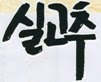
실고추 silgoch'u is literally 'string hot pepper'. These are dried chili peppers sliced unbelievably thin and great on noodles. 태양초 t'aeyangch'o 'sun candle(?)' is a traditional way of sun-drying red peppers, though I am sure a factory was involved here. This is actually a Korean-American product, under the Assi brand of the Rhee Brothers. On the back, a sticker has carefully been placed over the original package's “product of korea produit de coree”; it says, “product of china produit de coree.”

고추장 koch'ujang is Korean hot bean paste, made with 태양초 t'aeyangch'o in fermented soy beans. I'm not 100% sure what makes this 골드 goldŭ (gold); perhaps how long it was fermented. We didn't need a fresh tub this time, and it looks from the 해찬들 haech'andŭl product page like the packaging has changed since then, getting rid of the simple “italic” typestyle.
With candy, the graphic design gets a bit more sophisticated.

검은깨 캬라멜 kŏmŭnkkae k'yaramel, with the first part in a hand-painted brush style and the second in a geometric style.
For more aggressive design, of course one has to go with kid's snacks.

감자 kamja is 'potato'. This is 오리지날 orijinal (original) flavor; if they had other flavors at the store, we didn't notice them.

고래밥 koraebap 'whale rice (i.e., food)' is like Animal Crackers, but not as sweet and shaped like sea creatures rather than circus animals. This is the 매콤한맛 maegomhanmat 'spicy flavor'. If the web site is to be believed, these are a favorite bar snack as well as being for kids. In the translation of the jingle "♬재미로 먹고, 맛으로 먹는 오리온 고래밥~♪" chaemiro mŏkko, masŭro mŏknŭn orion koraebap, that they give there, "♬Orion Goraebab for Fun and for Taste~♪", it's interesting that they don't translate either of the verb forms of 먹 mŏk 'eat', 고 -ko is the gerund 'eating' and 는 -nŭn is (if I understand rightly) a reference to an earlier mention of the verb, so '[that] eating' or '[the one who is] eating', which actually is kind of hard to put into simple English. There is a goraebab.com; it will start playing a song, which is probably very annoying to your coworkers, and even without sound it is pretty hard on the eyes, if you're over fifty like me.
The only Hanja on this package (or any of the others, as far as I can tell) is 無 mu 'no; none', next to 첨가 ch'ŏmga 'additives' and above MSG. I bet this is part of some coordinated campaign for healthier junk food. By coincidence, one of the free Korean newspapers we picked up on the same trip has a profile of the recently deceased 마르셀 마르소 marŭsel marŭso, so I couldn't help but relate this lone character to the only spoken line in Silent Movie, “Non.”

The dictionary says 이구동성으로 igudŭngsŏngŭro means 'with one voice'. Together with the tag line, “아니, 이게! 과자야? 피자야?” ani, ige! kwajaya? p'ijaya? “Is this a snack or a pizza?”, I think the idea is that those apparently contradictory statements actually agree. It also works a little better because 과자야 kwajaya 'confectionary' and 피자야 p'ijaya 'pizza' rhyme. Using the circles as pizzas is maybe going a little too far in the kiddie direction.
Another snack that we saw, but decided against ultimately because it has MSG in it, was 꼬깔콘 kkokkal-k'on, the Korean version of Bugles, with its wobbly looking patch'im. But now that I'm looking around, I see that it has a cult following on English language snack sites. That one says it is made by Rhee Brothers. But the package says 롯데 Lotte and it features prominently on the confectionary division's site. The name comes from kkokkal, the name of the traditional Korean peaked hat, and based on Google Image search, a paper hat kids wear at parties; plus 콘 k'on as in 팝콘 p'ap-k'on (popcorn).
To get more interesting type design than at the supermarket, one needs to move to the area of conceptual corporate design and fine arts. I think the Korean avant-garde designer and typographer that is the most well known in the West (the only one I know by name) is Ahn Sang-Soo 안송수. There is a book about his work published in France in French and English. He features prominently in the issue of Idea Magazine (a design magazine from Japan) on Korean graphic design (which also has an article on typography in Korea in general; I need to track down my copy or find it at the library) and in European typography magazines. Here is an interview from Theme magazine. (Don't miss the picture of the gate to his house.) Of course, he also gets mentioned in English language Korean media, like this here. His design magazine 보고서/보고서 pogosŏ/pogosŏ 'report/report' is the only one listed for Korean typography in OCLC. Some images of a recent exhibition at the Rodin Gallery are online, but with absolutely horrible DRM that makes navigation almost impossible. His blog is mainly filled with snapshots of people he meets covering one eye. He also has a Hangul Dada site. I believe the font in which 한글다다 han'gŭl dada is written on this poster is called I-Sang, in honor of the writer. This is kind of like karo-ssŭgi, except that some sense of the original placement is maintained by putting the three chamo at different vertical positions. But Ahn goes even further, snaking them around on non-orthogonal baselines. He has designed posters for Hangul Day. (I assume what one usually sees is like these booklet covers.) One is illustrated in the Theme article. Another, the 한글 만다라 han'gŭl mandara (mandala), is here (or just the image if the DRM gets in the way).